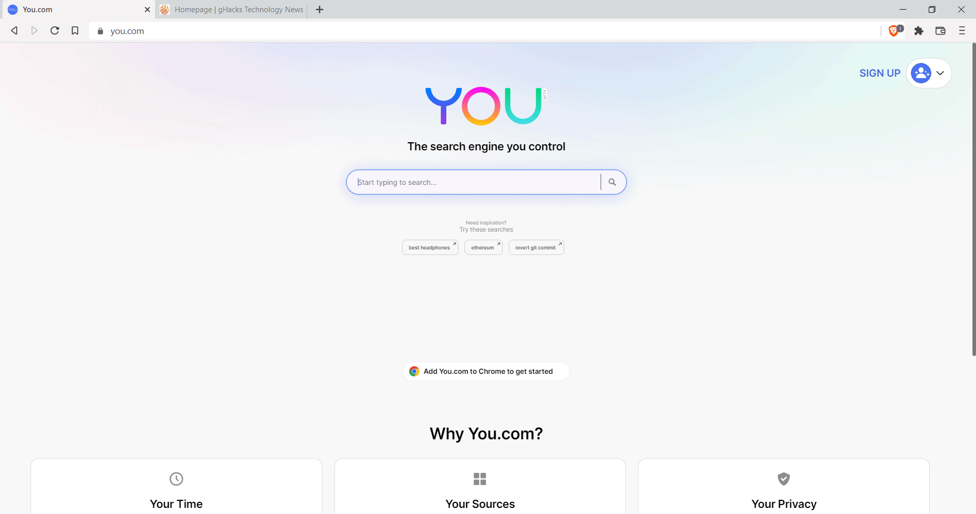
You is a relatively new search engine that is currently in beta. The creators describe You as a search engine “that summarizes the best parts of the Internet” for its users. Currently, You has no ads and strong privacy features, especially in private mode.

According to You, sensitive data is never stored by the service or sold or distributed to third-parties. Users may use the search engine with or without an account. Using an account trains the AI that You uses to deliver improved search results to the user.
You has a number of features that differentiate itself from traditional search engines. One of the features is support for apps. Basically, what this does is add sources that are supported to a section of the results listing. If you trust a particular source, say, Stack Overflow for coding, BBC News for news, or Yelp for information about places, then you may add these to your search experience.
The list of sources has about 150 entries currently. There is no option to add your own sources, and at least some of the sources appear to have been picked because of popularity and not quality. Also, at least in Beta, You is focusing on the United States. You can check out the listing here.
The design that You uses for displaying search results is different as well. You get the option to use a compact or detailed design for the results, and may switch between dark and light themes as well. When you start typing a search query, suggestions are displayed automatically.
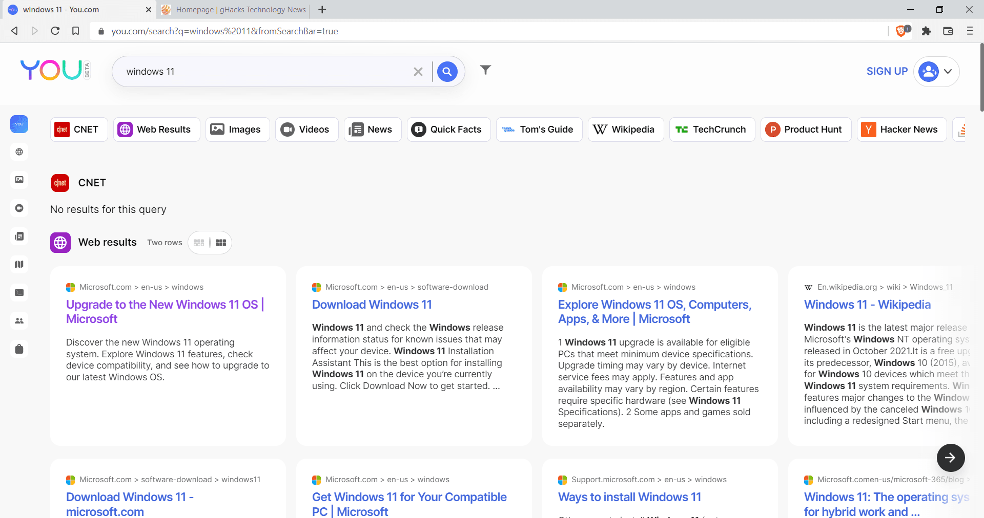
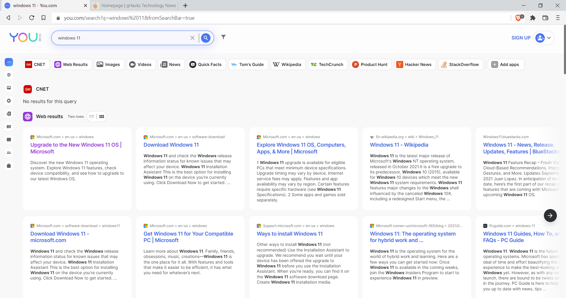
The search page may look crowded on first glance. The following screenshots show the default compact results layout first and then the detailed layout.


Both feature an app listing at the top, CNET, with no results for the query Windows 11, and below that the actual results. You uses a card layout to display results horizontally and vertically. Results of a specific section scroll horizontally. There is no option to change that behavior,
Quick jump links are displayed at the top and the side of the interface to jump to a specific part, e.g., to jump to image or video results, or to a specific application. A click on a result opens it in the same tab, but you can switch that with a click on menu and the toggling of “open links in a new tab” if you prefer it.
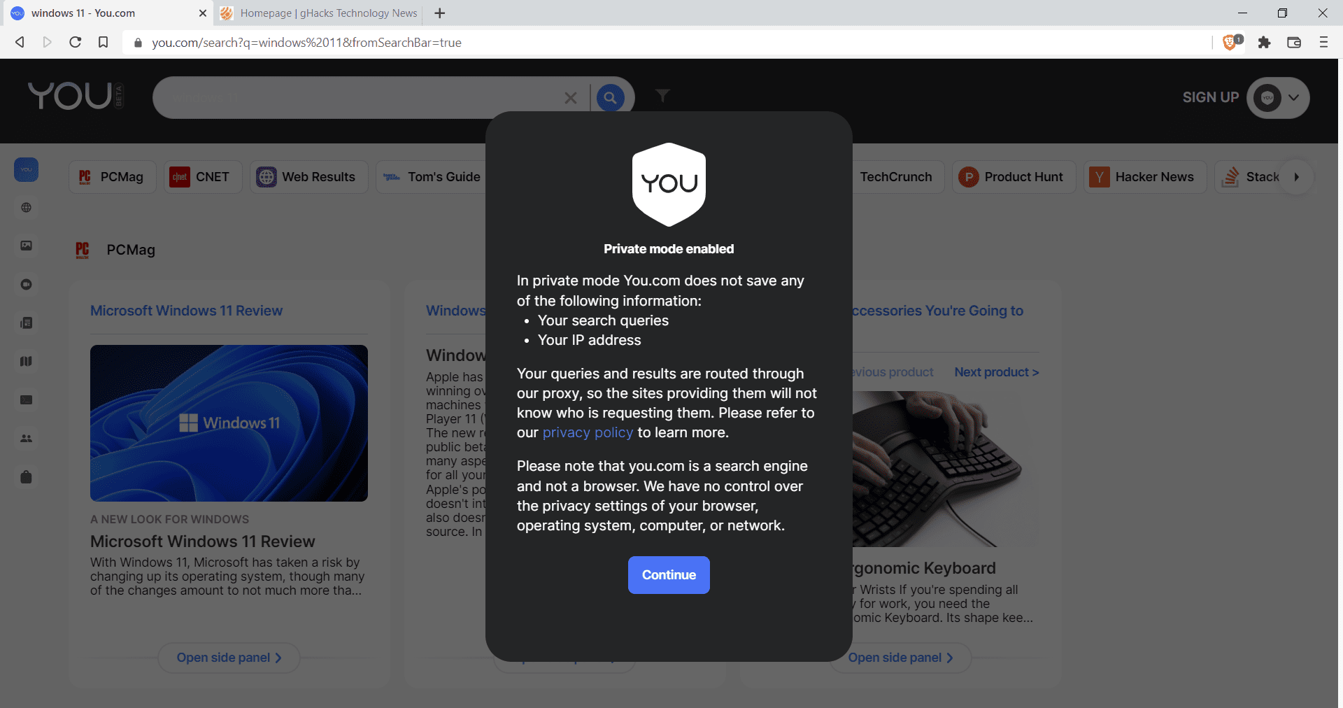
You’s private mode may remind you of the browser’s private browsing mode on first glance. You does not save search queries or the IP address while the mode is active.

Also, all search queries are routed through proxies that You provides so that the providing sites do not come into direct contact with the user’s IP address or device.
Closing Words
You does not mention how it sources its results. Is it crawling the web on its own or does it use results by one of the main search engines? I tried to find the answer to that but the FAQ does not reveal it.
I used You.com for some time but not enough to judge the definitive quality of its results. My impression so far is that its results were not better or worse than those provided by other search engines for the most part.
One part that stands out is coding and programming related results. You display code snippets when possible and these often reveal what you require right away.
The Apps feature sounds good on paper, but it is too limited in my opinion even for a Beta and the quality of some of the used sources is not the best.
In conclusion: You is a search engine that has a few distinguishing factors when compared to other search engines. The layout may look too crowded for some, and horizontal scrolling is not everyone’s cup of tea either. For some query types, for instance coding snippets, it appears to offer better results than traditional search engines such as Google.
Now You: have you tried You.com?
Thank you for being a Ghacks reader. The post A quick look at the new search engine You.com appeared first on gHacks Technology News.
