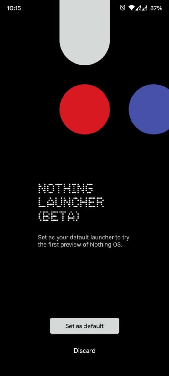
A couple of weeks ago, Nothing, the company founded by Carl Pei, released a new launcher app to tease a preview of Nothing OS. While it was intially limited to the Samsung Galaxy S21/S22 and Google Pixel 5/6 phones, Nothing Launcher Beta is now available for all devices running on Android 11 or above.

Let’s take a tour of its features, and find out if it offers something new.
Home Settings
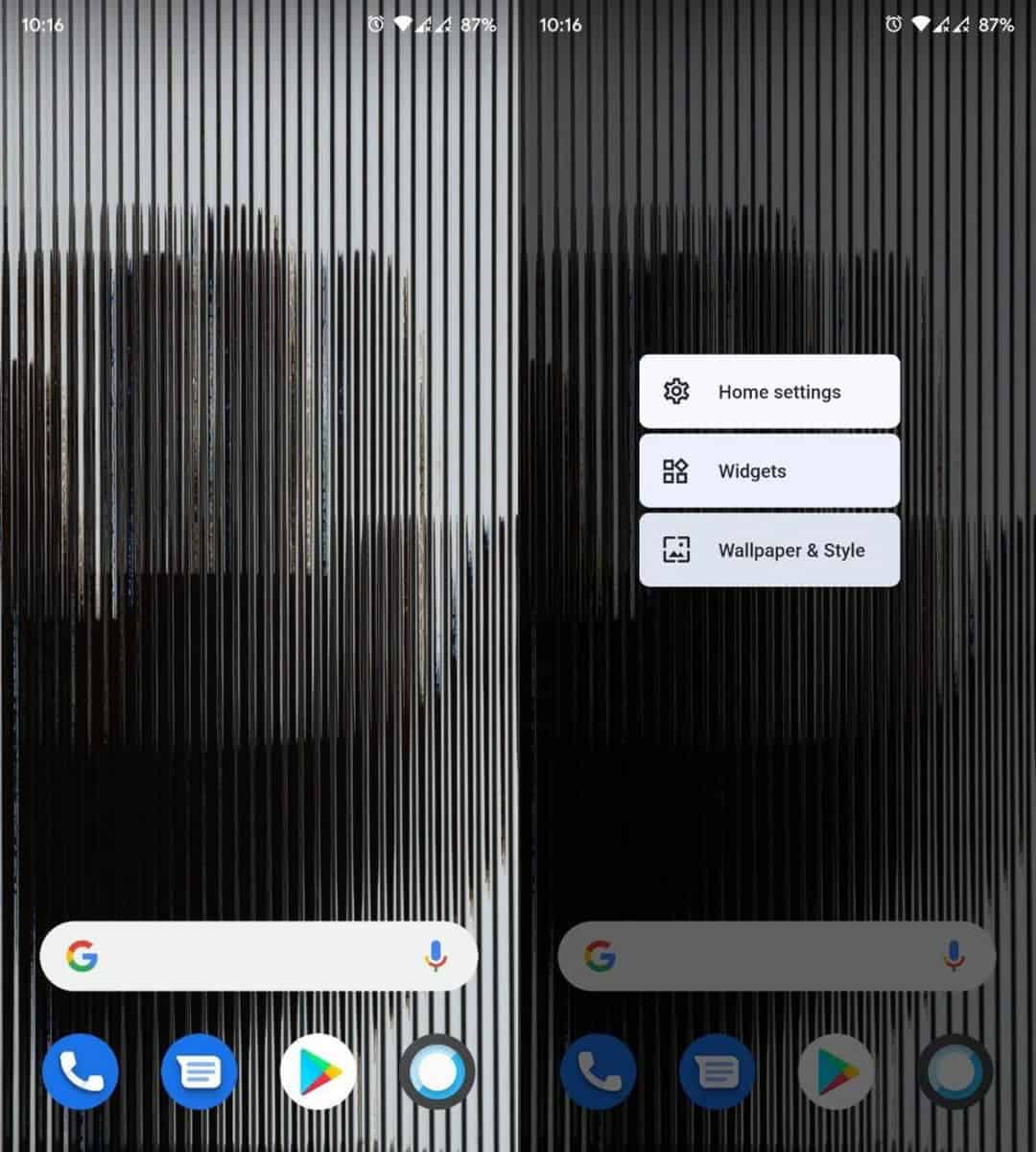
Long press on a blank are of the homescreen to view the launcher’s menu. It has three shortcuts: Home Settings, Widgets, Wallpaper & Style.

The Home Settings allows you to set Nothing Launcher as the default launcher. You can toggle the Notification Dots option, which will display a badge on top of icons to indicate a new message has arrived. The launcher will automatically add new icons to the desktop when you install apps, you can change this behavior from the Settings.
Gestures
Swipe up on the screen to access the app drawer. Swipe down to view the quick settings panel, a second swipe downwards displays the notification panel.
Widgets
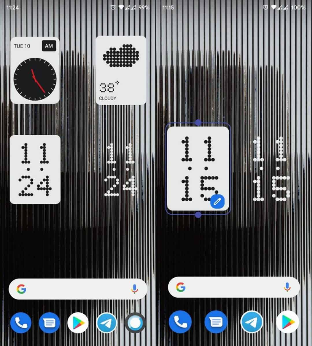
Long press on the homescreen and tap on the Widgets option. Scroll the list, and drag the widget to the homescreen where you want to place it on. Once you have added a widget, you can resize it by long pressing on it and dragging its sides. To delete a widget, tap and hold it and drag it to the top of the screen where it says “Remove”. To edit a widget’s settings, tap and hold on it, and then tap the Edit button (pencil icon).
Nothing Launcher ships with three clock widgets, an analog clock, a digital clock, and a weather widget. The digital clock has a solid style and a transparent style.

Note: The weather information seems incorrect, at least for my region. It was nearly 12 degrees Celsius off the mark. I tried setting the location to some US cities, and the results were better. So, the weather provider used in the launcher could be the issue here.
The Google Search bar at the bottom of the home screen is not a widget, and it’s persistent across all screens. It cannot be removed and takes up a lot of space.
Wallpaper & Style
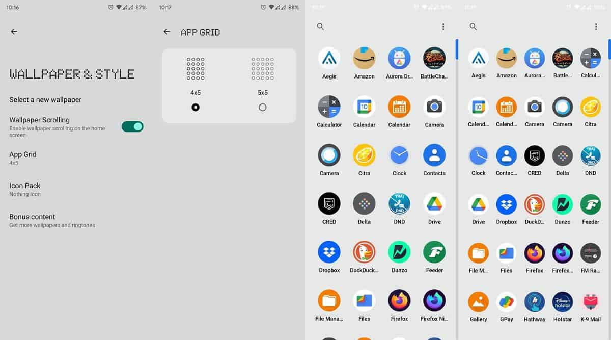
Nothing Launcher has unique bespoke wallpapers, all of them have a glass panel effect with some vertical lines. You can access the extra wallpapers and ringtones from the Bonus Content page. The app supports Wallpaper Scrolling across home screens.

The App Grid setting lets you set the app drawer’s size, you may choose between a 4 by 5 or a 5 x 5 grid. This also affects the dock’s size and lets you place 5 icons on it.
The launcher uses icons that are close to stock Android’s style, this could be a hint that the upcoming Nothing 1 Phone could run on an OS that is like AOSP. The icons might be boring, but the good news is that Nothing Launcher supports third-party icon packs.
![]()
The bad news is that the launcher lacks an edit option for shortcuts, meaning you cannot change the icon style of a specific shortcut, or rename the shortcuts. You can create folders by dragging an app shortcut over another one, and it lets you rename folders.
Max Icons and Max Folders
Two features that stand out in Nothing Launcher are the Max Icons and Max Folders that you can toggle. Long press on an app’s icon on the home screen and press the <> button to maximize the icon’s size, it turns the shortcut to a huge button. Likewise, you can enlarge a folder’s size.
![]()
Icon packs used in the screenshots: Delta Icon Pack and Arctic Icons (Dark and Light icons). The apps are free and open source.
Is Nothing Launcher any good?
If you’re using Nova Launcher or Lawnchair or a similar app with a lot of customization options, I don’t think you’ll find that there is anything special about Nothing Launcher. It’s still in beta, so there’s room for improvement. The app’s free and doesn’t have ads, so I think it is worth a shot.
Download the Nothing Launcher beta app from the Google Play Store.
What do you think about the app?
Thank you for being a Ghacks reader. The post Nothing Launcher beta is now available for devices on Android 11 or above appeared first on gHacks Technology News.
